Creating a personal website is something I've started many times before, usually ending up bored with the idea and unhappy with the outcome.
Having finally created something I'm pleased with, I thought it worth exploring a little about my initial ideation process in this opening post. The points listed below may qualify as common sense, but they're a decent enough place to start.
- Try not to aim for perfection, it should be fun.
- Find a direction and stick to it, it's easy to get distracted.
- Digital projects can be refined and adjusted.
- Trust yourself, go with what feels right to you.
- Try seeking feedback once you've made a solid start.
The first step in finding my direction was to try to define what I do and what this site should be. Specialising in areas that overlap design and development made it difficult. Also working in agencies people can try to pigeon-hole you, this has occurred most of my career and is often the cause of serious imposter syndrome.
“Wait, so you're a dev? But you're also familiar with design concepts? How does that work? Is that even a thing? What team should you be in?” Okay, maybe it's not quite that bad, but there are real challenges along those lines.
It's particularly challenging when it comes to convincing stakeholders or reluctant graphic/print trained designers that knowing about the web, it's limitations and possibilities totally help digital design results.
Anyway, I digress. I only mention it because these types of experiences helped guide me on how to distil my capabilities down to a single coherent idea.
My initial thought was to cap the phrase to a maximum of two words, for simplicity. I didn't want to just settle on Front End Developer or Digital Designer, but I thought the term Digital was a good starting point.
Digital
adjective
“Using or relating to digital signals, computer technologies and the World Wide Web.”
No arguments there, my day-to-day work is creating experiences that function using a combination of everything mentioned above. That wasn't so hard.
The tougher task was deciding what word should follow. I toyed with the idea of Labourer, Creative, Tradesman and other similar terms but nothing felt totally right. Maybe searching for inspiration would help?
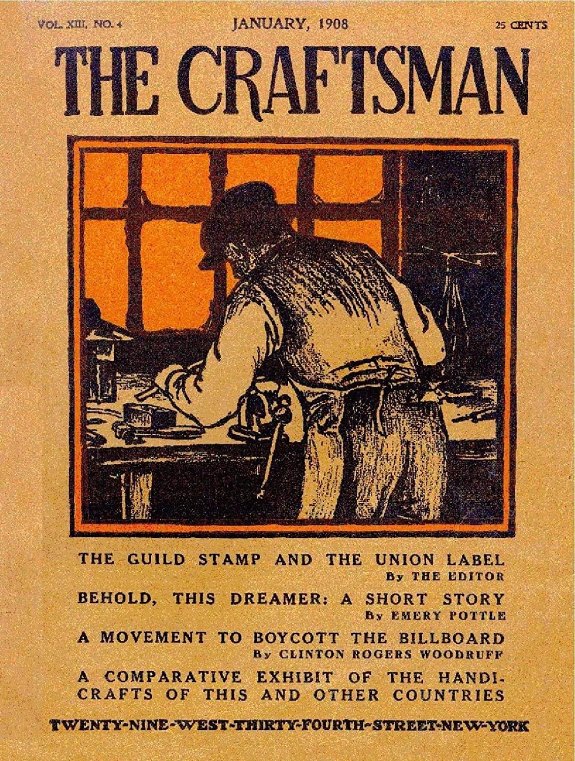
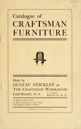
The search began with typefaces and colours, I liked the idea of using a blackletter font and a maximum of two colours for the palette. This led me to stumble upon examples of early 1900s Craftsman literature.
Craftsman
noun
“A skilled worker who makes items by hand that are functional or strictly decorative.”
That sounds about right. I make things by hand (don't laugh!) I create items that are functional and serve a purpose, I also enjoy making things that are simply nice to look at.
So ultimately, Digital Craftsman is the descriptor I landed on. It might sound grandiose and even a bit cringey, but it makes sense to me and more importantly I feel like it encapsulates my skill set.
With terms selected and immediately falling in love with the aesthetic of the old guide books and manuals I'd found, I was onto something. I've included some examples of the research below. The Internet Archive was a great resource for this kind of stuff.
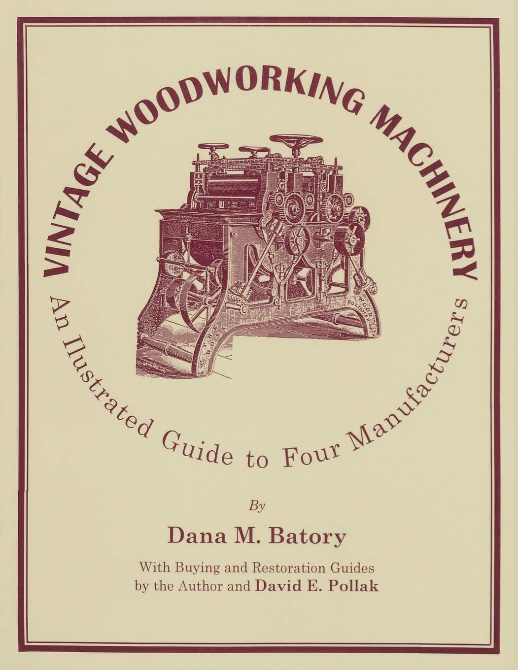
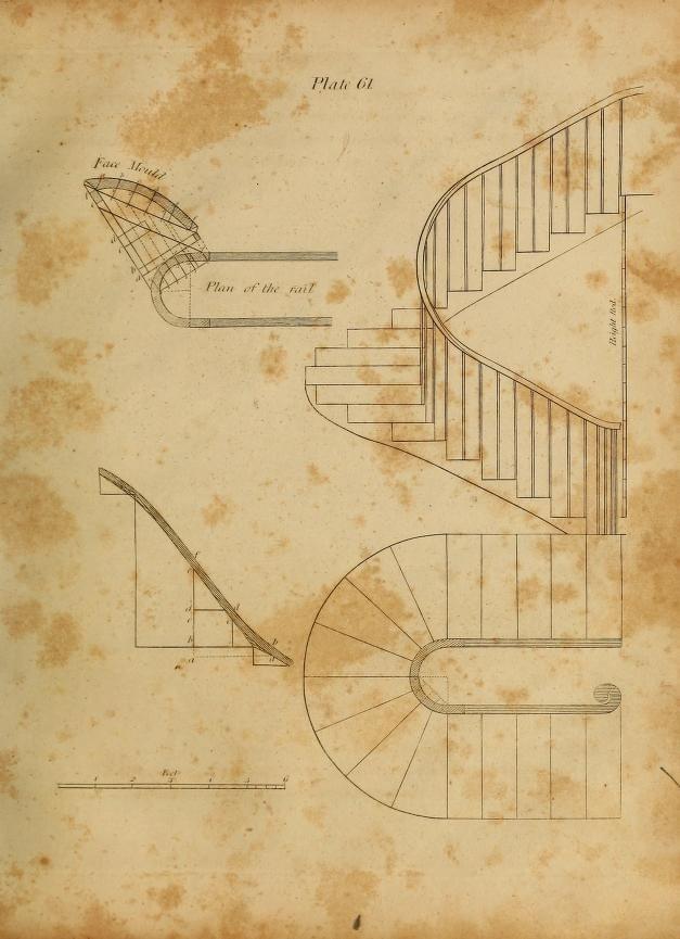
There are loads more I could share, but hopefully this gives an idea of the rabbit hole I descended as the idea began to take shape in my mind. From this point everything started happening fairly rapidly.
With a decision made on design direction, I moved on to mocking up concepts. This included playing around with layout configurations, font & colour combinations and animating possible interactions.
From there it was a matter of jumping into the browser, setting up an Eleventy base build (shout out to 11ty.rocks) and creating a mini Sass-based design system. The most time-consuming stage was refining the intro and consequent interaction animations.
In total, the site was designed and built in several weeks (using little bits of spare time, spaced out over many months.) The following is a list of the main tools used throughout.
- Figma — Design ideas
- Useandmodify — Font research
- Eleventy — Static site generator
- Greensock — Animations
- Netlify — Hosting
I also want to give mention to Peter Wojcieszek for letting me use his fantastic exploded mouse drawing on the home page and to Velvetyne for making their incredible font Bluu available for free. The body font (also incredible) is Cormorant designed by Christian Thalmann. Thanks, Christian!
Coming up with the idea, fleshing it out, sticking to my guns and finally launching a personal site feels like a big, tiring yet rewarding achievement. It feels nice, especially getting it done alongside full-time work, in the midst of a pandemic.
The site's not perfect, there's still work to do, but it's something I can refine and adjust in the future.
I should also stress this post is very much scratching the surface of an individual piece of work, it's not one-size-fits-all and I'm not suggesting it's how you should work. It's just how this particular project happened to pan out.
The plan from here (when not finding bits to adjust or improve) is to use this section of the site to keep writing, not necessarily about tech or design, but just whatever strikes me at the time.
At a later date, I might also go into more detail about individual components of this build that were challenging or extra fun to make.
Jacob.